All projects
Available

Nano Banana Workbench

A local review workbench for comparing image-generation recipes, checking variants at real display sizes, and saving the prompt, settings, and selection beside each exported asset.
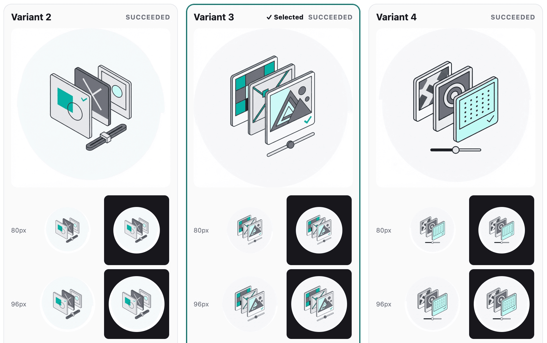
The Nano Banana Workbench comparing three generated icon variants at full and production preview sizes

Three generated variants, one selection, and the same icon checked at its production review sizes.

Generating one image was easy

I wanted every project on this site to have its own icon without turning the projects page into a sticker sheet. A chat window could get me one good image at a time. It did not give me a durable style rule, a fair comparison, or an easy way to remember which settings produced the file I shipped.

What the fork adds

Nano Banana 2 already had a useful Gemini-backed CLI for prompts, reference images, model settings, transparency, output files, and cost history. I kept that interface, moved its shared behavior into reusable modules, and built the Workbench on top: a local server, generation queue, session store, recipe system, and browser UI. It is not another image model. It is the review and production layer around one.

The loop is deliberately short. Choose one to three recipes, describe the subject, lock the provider settings, and review the call count and estimated cost. The Workbench generates independent variants, shows them side by side, and exports the selected result. The API key stays in the server process rather than entering the browser.

The Porsche icon was the first real run. Four candidates came back from the same geometric recipe. Instead of opening files in separate tabs and mentally shrinking them, I could compare the full images and their tiny previews in one place, select the strongest one, and export the asset now used on its project page. The version I kept held onto the low wedge and pop-up headlights at 80px, while leaving the wrench and spark plug as a subordinate rebuild cue.

Keep the style separate from the subject

The Workbench stores visual direction in versioned JSON recipes. The subject brief can stay narrow, while the recipe carries the palette, composition rules, small-size constraints, review sizes, and export contract. I can use the same recipe for a Porsche, a payphone, or a developer tool without rebuilding the site's visual language inside every prompt.

A run locks the model, resolution, aspect ratio, reference images, and Search setting across every candidate. It can compare up to three recipes and generate one to eight variants from each. Calls are bounded and interleaved, with an explicit confirmation above eight calls or an estimated $1.

Review the image where it will live

The large candidate is only half the review. The Workbench checks project icons at 80, 96, and 112 pixels, on both light and dark backgrounds. This site uses 96px icons on the project index and 112px icons on detail pages; 80px is an extra stress test. Delicate lines and clever details get a chance to fail before I commit them.

The selected candidate exports as both the untouched provider image and a 384×384 circular RGBA PNG. The production conversion is mechanical: resize, mask, strip metadata, and compress. It does not quietly redraw or recolor the answer after selection.

Keep the trail

Every session keeps the rendered prompt, recipe snapshot and hash, provider settings, ordered references, candidates, usage, estimated cost, selection, and exports. Regeneration links back to the session it came from.

That matters on a blog because artwork accumulates slowly. Six months from now, adding one project should not require guessing how the previous six were made. Gemini does not expose a seed, so the pixels are not reproducible. The request, decision, and production path are.

Five answers to the Porsche brief

After choosing the production icon from an earlier geometric run, I sent the same brief through the flat cut-paper, geometric isometric, and restrained screenprint recipes. The subject and provider settings stayed fixed; the visual contract changed. From left: cut-paper, geometric, screenprint, cut-paper, and geometric. The comparison clarified why geometric won: it kept the wedge and pop-up headlights legible while leaving the engine cue secondary. Screenprint made the repair symbols too dominant; cut-paper softened the car into a more generic coupe.

Flat cut-paper Porsche 944 icon with raised headlights and a teal front accent
Geometric isometric Porsche 944 icon with an engine and wrench resting on the hood
Restrained screenprint Porsche 944 icon with teal wrench and piston symbols
Flat cut-paper Porsche 944 icon with a piston and gear over a teal lift
Geometric isometric Porsche 944 icon with a teal engine symbol on the hood

The payphone changed what each recipe emphasized

The second subject was the Hot's Pizza payphone, with permission to get a little wacky and use the pizza shop as context. Screenprint kept the payphone clearest at small size. Geometric isometric exposed the electronics by turning the base into a circuit board. Cut-paper pulled more of the shop, pizza, and loose wiring into the composition. From left: cut-paper, geometric, screenprint, cut-paper, and cut-paper.

Flat cut-paper payphone with its handset, wiring, and a wireless signal
Geometric isometric payphone mounted on a circuit-board base
Restrained screenprint payphone with a visible Raspberry Pi and wireless signal
Flat cut-paper rotary payphone with exposed wiring and electronics
Flat cut-paper payphone in front of a pizza shop with a pizza slice and Raspberry Pi

The car and payphone made the distinction visible: the subject changes; the recipe carries the house style. The source is available on GitHub. The CLI generates the images. The Workbench handles deciding which one to trust, remembering what I chose and how it was made, and shipping it correctly.